







Art & interiors
How to Choose Art for Your Living Room

The right art can change how a living room feels before you move a single piece of furniture. Use scale, colour, light and framing to find a work that belongs in the room and still feels personal.
Begin with the feeling you want
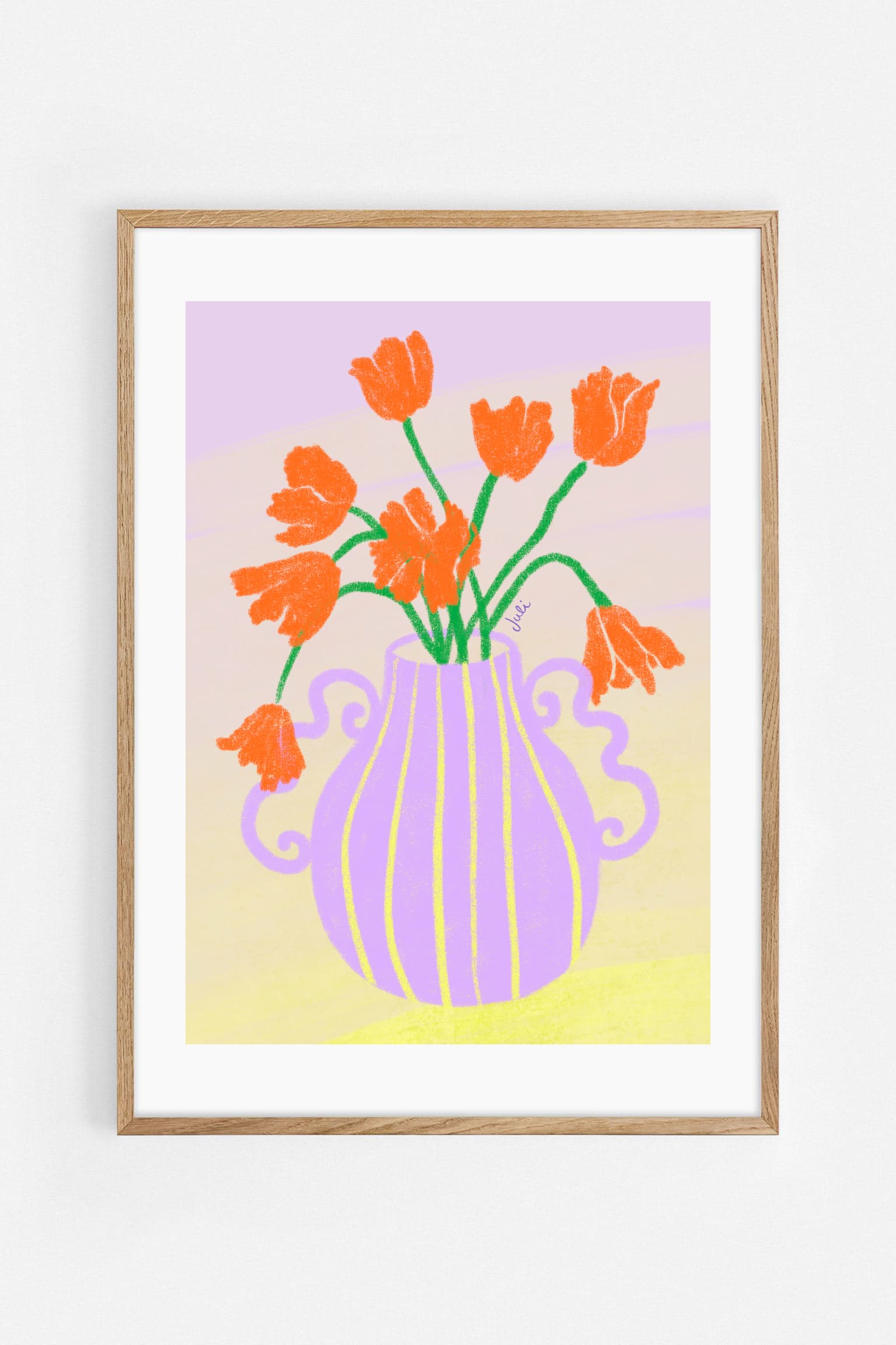
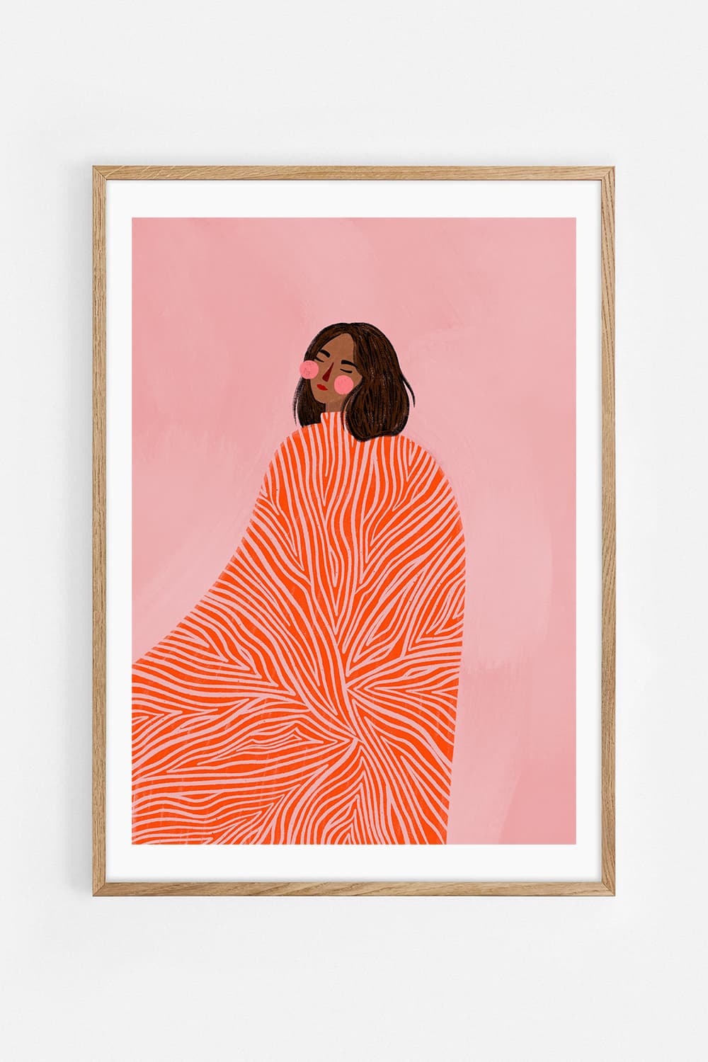
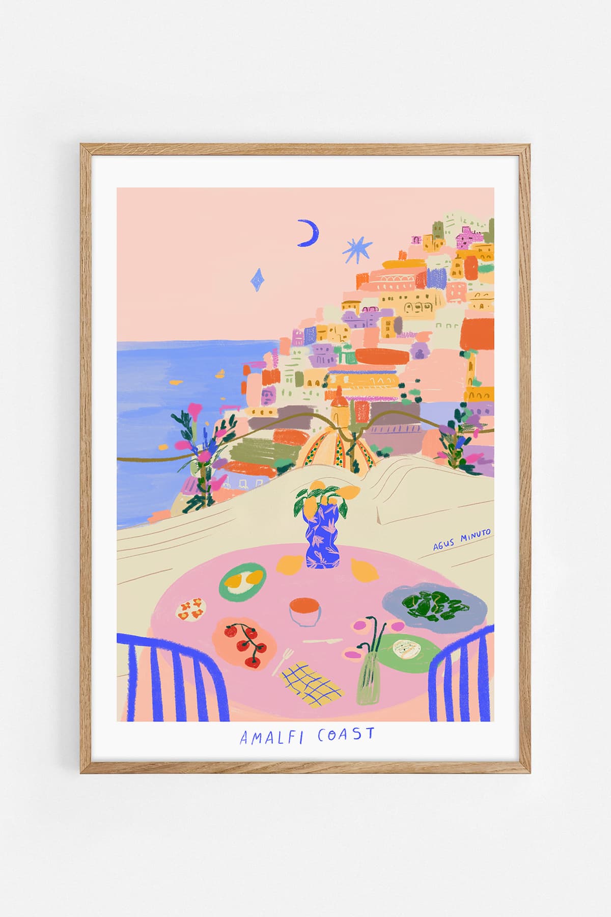
Before choosing a subject or colour, decide how the room should feel. Calm rooms often suit soft photography, restrained abstract work and spacious compositions. More expressive living rooms can carry bold illustration, saturated colour and strong graphic shapes. There is no correct style—only a clearer intention.
Choose the right scale
Art that is too small can look disconnected from the furniture below it. Above a sofa, the total width of the artwork or group of artworks can often be around two-thirds of the sofa width. A large statement print creates immediate focus, while a pair or gallery wall allows a more layered story.
Work with the room, not against it
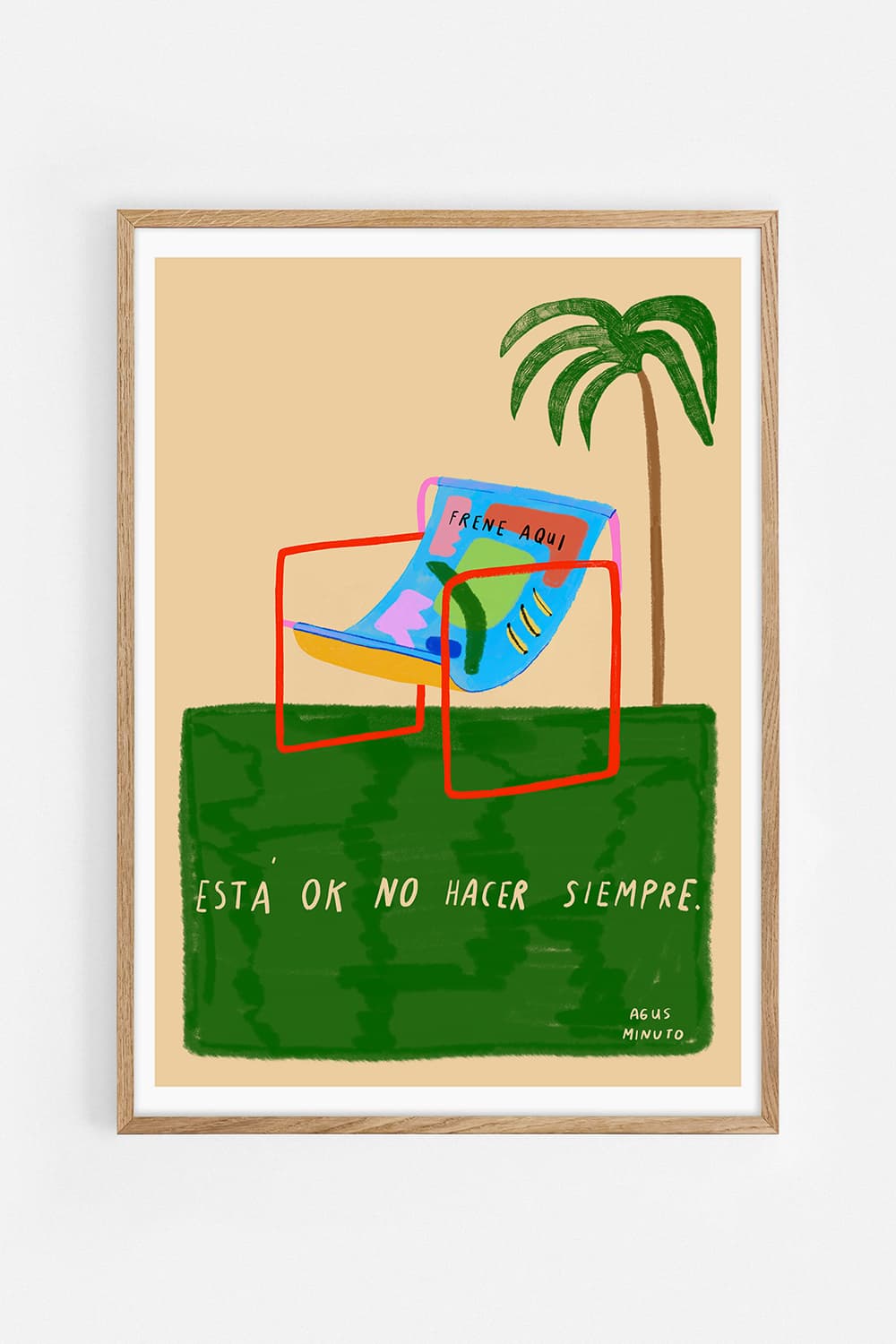
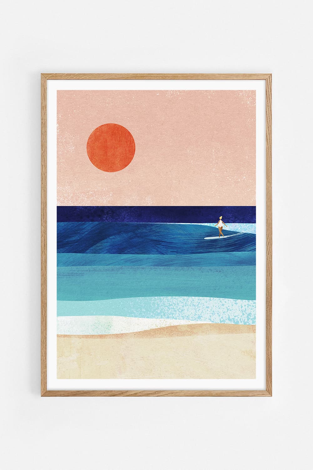
Look at the colours already present in rugs, cushions, books and objects. You do not need an exact match. Repeating one accent colour is usually enough to make the artwork feel at home. Alternatively, choose a deliberate contrast: cool blue art in a warm interior, or a red detail in a quiet neutral room.
Consider the available light
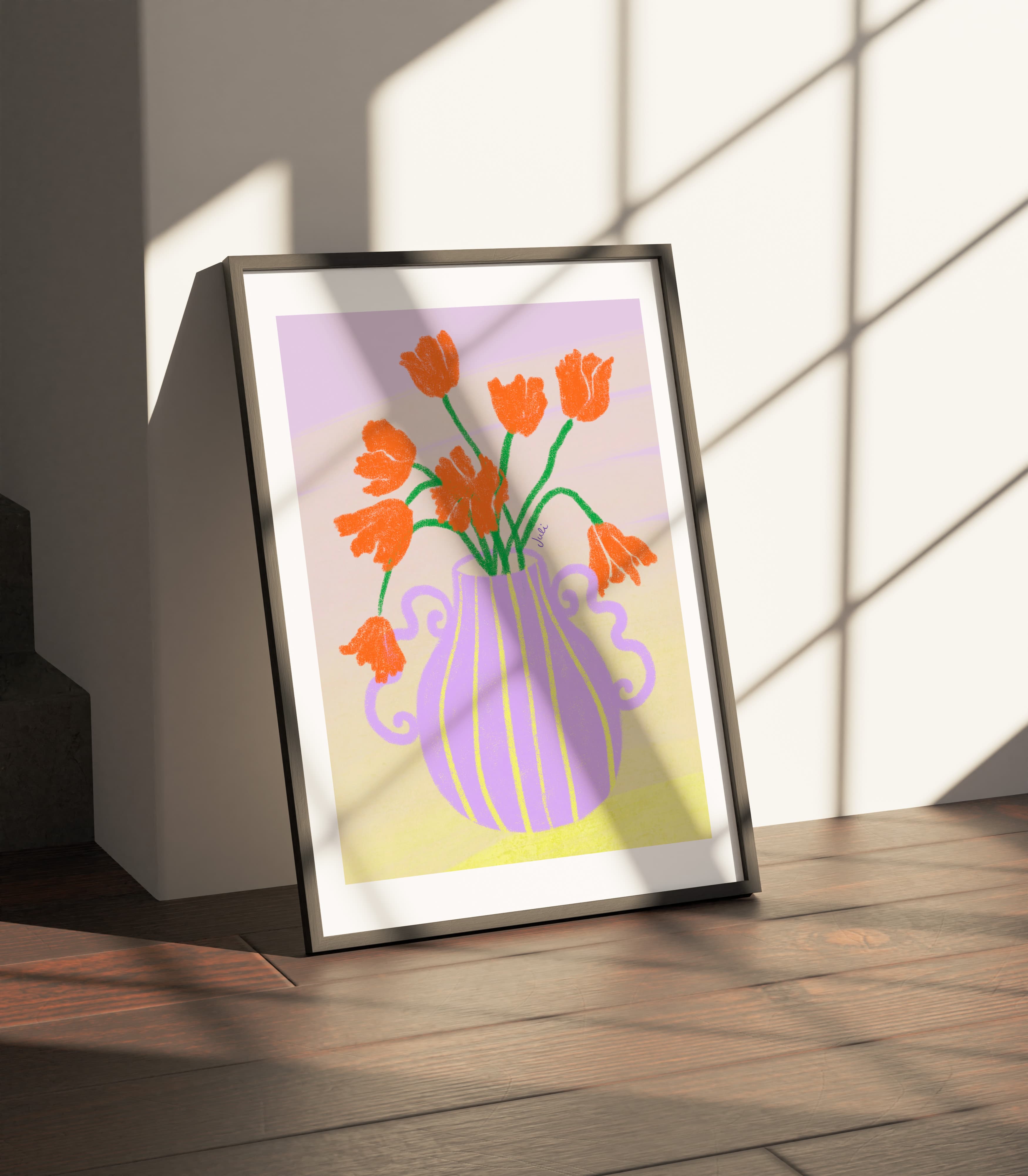
Direct sunlight can be hard on printed art over time. Place important works away from intense, continuous sun where possible. In darker rooms, pieces with lighter backgrounds can create openness, while deep colours can add intimacy when supported by good ambient lighting.
Let the artwork lead the frame
Oak works well in warm and natural interiors. Black creates definition and suits graphic or high-contrast work. White frames recede and keep the focus on the image. You can preview frame choices while browsing our art prints and posters.

Choose art you want to keep looking at
Trends can help you discover a direction, but the work should hold your attention after the room is finished. Notice which images you return to, which artists make you curious and which pieces create an emotional reaction. That response is often a better guide than matching every colour perfectly.
One artwork or a collection?
A single large piece gives a room clarity. Two works can create rhythm. A gallery wall feels more personal and can combine different memories, styles and artists. If you want to build a group, read our guide to creating a gallery wall and explore the stories behind our independent artists.
Living room art questions
How large should art be above a sofa?
A useful starting point is for the artwork, pair or complete gallery wall to span roughly two-thirds of the sofa width.
How high should art hang above a sofa?
Leave approximately 15–25 cm between the top of the sofa and the bottom of the frame, while keeping the artwork's centre close to eye level.
Should living room art match the furniture?
It does not need to match exactly. Repeating one colour or material can connect the art to the room, while a deliberate contrast often creates a stronger focal point.