







Art & interiors
Warm and Cool Colours in Art: Choose Their Roles

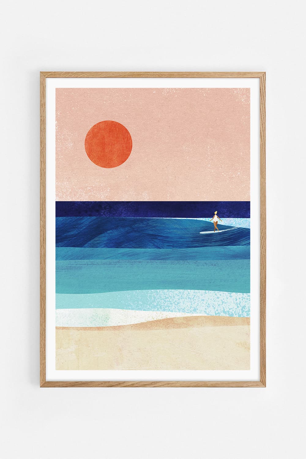
Combining warm and cool colours is easier when each artwork has a clear role. Vibrant Orange Abstraction by Ejaaz Haniff supplies a concentrated orange gesture; Calma by Consu Juncosa brings dark-blue water and many small tonal shifts. Compare the two whole images before deciding whether one should lead or the pair should share attention.
Treat temperature as a colour relationship
Orange is the warmer side of this particular comparison and blue the cooler one. That describes their visual relationship, not a change in room temperature. Greens, pinks and neutrals need comparison with their neighbours too. A single colour name cannot explain every undertone or the influence of the background around it.
Separate hue from light and dark
Calma includes dark areas as well as lighter wave highlights. Vibrant Orange Abstraction has light ground around the orange marks. If the photograph feels heavier, the reason may be its darker value rather than simply its cooler hue. Compare the amount of dark area before deciding that the colours themselves are incompatible.
Decide which artwork leads
Try a larger orange work beside a smaller photograph for a stronger warm accent. Reverse the scale if you prefer the water to be the main scene. You do not need to balance the pair with equal amounts of orange and blue. Make that decision with correctly oriented paper templates and the frames’ full outside dimensions.
Keep the different formats intact
The abstraction is upright and the water photograph horizontal. A shared bottom edge gives a useful first outline for the pair. Do not rotate the photograph or stretch either image to force identical rectangles. The different shapes are another part of the composition, distinct from the warm-and-cool colour contrast.
Let a quiet material link the works
The same oak frame finish can give the pair a shared edge while the images keep their differences. A neutral wall and a restrained cabinet leave room to compare the colours. If you already have a rust rug or blue chair, include it in the test instead of judging the artworks against an empty digital background.
Compare one change at a time
Photograph two proposed layouts from the same position, then also look directly in daylight and lamplight. Change the size, sequence or gap one at a time. A screen and camera can shift colour, so avoid using a filtered image as a precise colour sample. Keep both artworks’ actual marks, crop and colour intact while adjusting the room around them.
Questions about this layout
Must warm and cool colours be used equally?
No. One can lead and the other provide a smaller contrast. Judge the whole room and the dark-versus-light balance as well.
Can I change a print’s colours to match my room?
These examples use the original artworks as offered. Choose a suitable work rather than assuming the product will be recoloured.
Artworks in this guide
 Vibrant Orange AbstractionEjaaz Haniff
 CalmaConsu Juncosa