







Art & interiors
Build a Colourful Gallery Wall without Losing Balance

A colourful gallery wall feels coherent when its colours have roles. One can lead, another can connect the pictures, and a quieter ground can stop the arrangement becoming a collection of competing accents. This three-print example starts with artwork, not a rule that every room accessory must match.
Find a bridge between the pictures
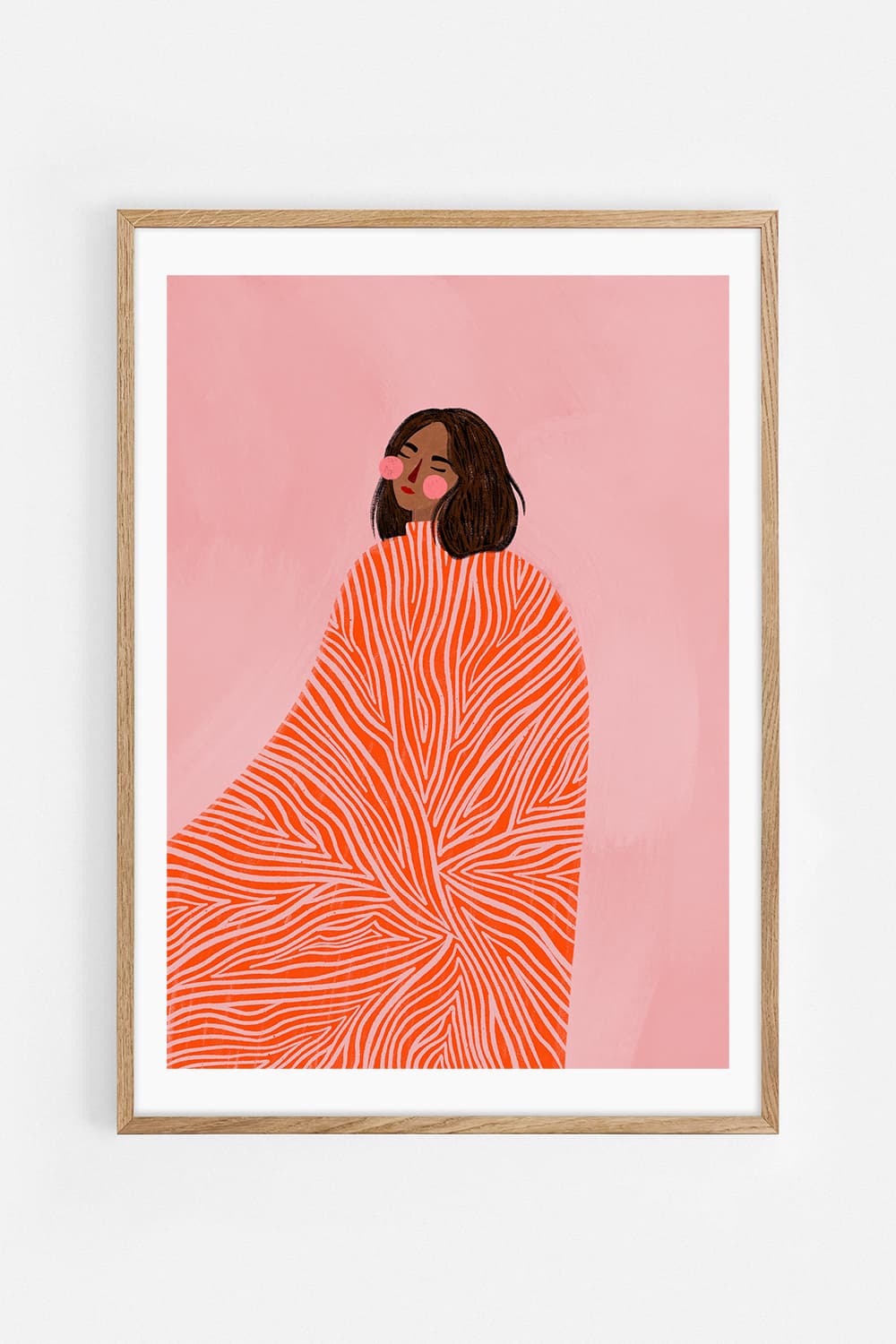
The orange garment and pink ground in The woman with the swirls by Bea Müller connect naturally with Vibrant Orange Abstraction by Ejaaz Haniff. The woman with the yellow dress, also by Bea Müller, introduces ochre and a different sweep of pale lines. Orange links the first two; the repeating curved marks help all three speak to one another.
Choose which colour should dominate
Lay the product images together on a neutral background before choosing sizes. If the orange abstraction is the largest work, orange becomes the leading note. If the pink portrait is largest, the wall reads more softly. You are changing the balance of the whole group without changing a single motif or adding decorative objects to force a match.
Use scale to separate the focal points
Try the abstraction in 50 × 70 cm with the two portraits in 30 × 40 cm. Alternatively, use three 30 × 40 cm prints when the wall is compact. Check each product for its current options, and allow for the frames beyond the paper size. Keep the smallest portrait large enough to recognise its face from the usual viewing position.
Repeat one material, not every colour
A shared oak finish gives the group a consistent outline while allowing the art to remain varied. A cobalt chair or a plain cream tablecloth can work alongside the arrangement without appearing in every picture. Avoid demanding an exact match between printed colours and fabric: daylight, screen settings and material texture all affect how colour appears.
Test the wall with the room included
Photograph the trial layout with the dining table, doors and light fittings in the frame. An arrangement that works as a cropped image may compete with a pendant lamp in the actual room. Move one picture, narrow the group or choose smaller formats before introducing more art. Keep the space around the group as deliberate as the spaces inside it.
Leave a route for future additions
Choose one open edge where a later work could join the composition. Keep the current group complete rather than leaving a conspicuous hole. When considering a fourth piece, ask whether it adds a new shape, a quieter moment or a useful colour bridge. Another intense orange rectangle may simply repeat a role already filled.
Questions about this layout
How many colours can a gallery wall contain?
There is no fixed maximum. Start with a clear relationship between the pictures, then assess the room as a whole.
Should the frames be colourful too?
They can be, but matching oak frames are a useful first test when the artworks already carry several strong colours.
Artworks in this room
 The woman with the swirlsBea Müller
 The woman with the yellow dressBea Müller
 Vibrant Orange AbstractionEjaaz Haniff